
Building for Everyone: Why Accessibility (A11y) Matters and How We’re Doing It

Introduction: Setting the Stage for Accessibility
When we talk about building websites, it’s easy to focus on cool features, fast load times, or visual design. But for me, real success is measured by who can actually use what we build. Accessibility—often written as “a11y”—isn’t just a technical checklist; it’s a commitment to making the digital world open to everyone, including people with disabilities.
(Quick note: medicine-people.com is still in active development, and not all features are available yet. If you visit and the site happens to be down, we’re probably rebuilding it—so check back soon!)
Why Accessibility (A11y) Is Important
According to the World Health Organization, about 15% of the world’s population lives with some form of disability, with 2-4% facing significant difficulties in daily functioning. If our sites aren’t accessible, we’re excluding millions of people. And here’s the practical angle: accessible sites reach more users, rank better in search, and build a better reputation for everyone involved.
In my opinion, a11y is about respect as much as it is about compliance. Yes, the web was designed to be for all—HTML and ARIA (Accessible Rich Internet Applications) attributes exist for a reason. But inclusion doesn’t happen by accident; it’s the result of deliberate design and development choices.
From Theory to Practice: My Experience with Medicine People
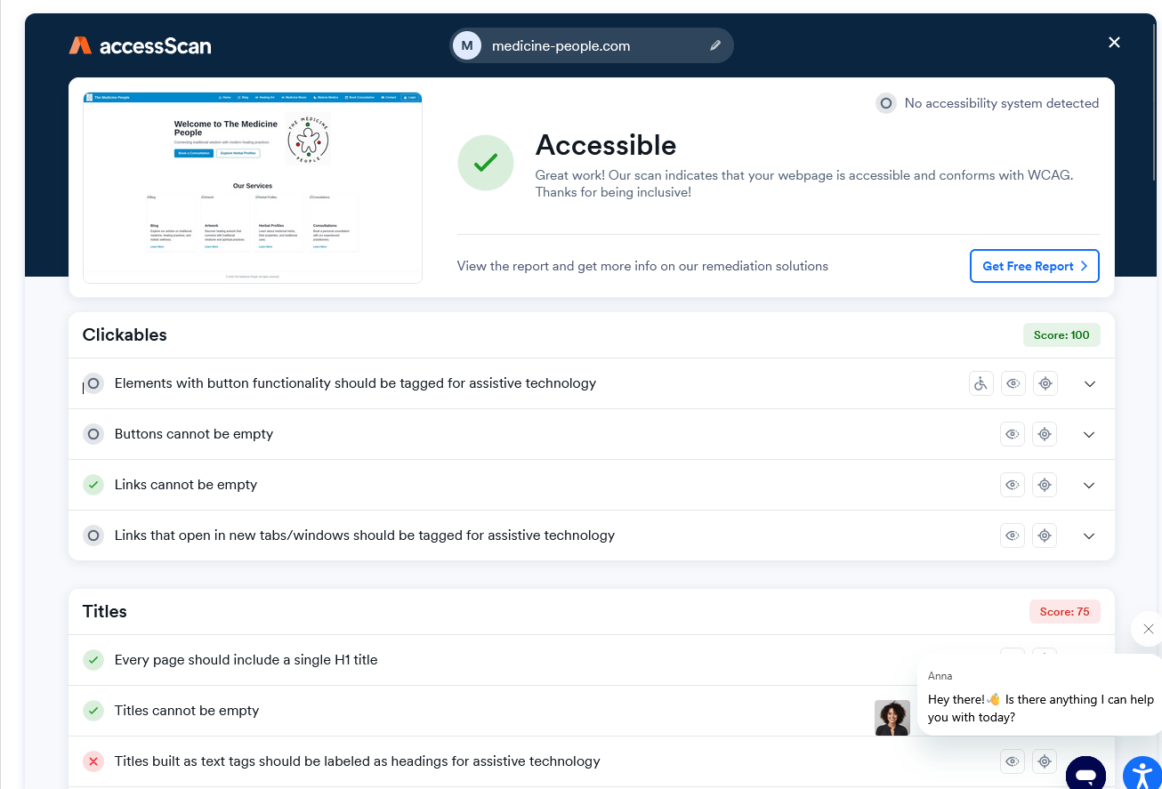
I’ve spent the last few weeks building medicine-people.com, a spiritual healing site featuring a blog, herbal advisory, healing art, audio, and online consultation booking. My tech stack: React for the frontend, Chakra UI for accessible components, and a Django backend. The site’s first accessibility test was a success: “Great work! Our scan indicates that your webpage is accessible and conforms with WCAG. Thanks for being inclusive!” That’s a milestone I’m proud of.
But what does accessible development look like in practice?
Building Accessible Navigation: The Sidenav Example
Every site needs a way to move around. For some, it’s a top nav; for others, a sidebar. I chose a responsive sidenav (side navigation) because it adapts well to both desktop and mobile devices. But building an accessible sidenav isn’t trivial. Here’s how I approached it:
1. Keyboard Navigation
Users must be able to tab through menu items in the correct order. If you rely on icon buttons (instead of text), every button needs an aria-label—that way, screen readers can tell users where the button will take them.
2. Responsive Design
On mobile, there’s not enough room for a traditional sidebar, so I use a “drawer” pattern: the sidenav slides in from the side and can be closed with a button. This drawer is triggered by an action that’s accessible both visually and via keyboard or screen reader.
3. Semantics and Landmarks
It’s not just about style—using semantic HTML (<nav>, <main>, <header>, etc.) helps assistive technology understand the page’s structure. Chakra UI makes it easy to swap out elements for semantic tags, so my navigation isn’t just visually present, it’s programmatically discoverable.
4. ARIA and Tooltips
Where icons are used, each gets a tooltip and an aria-label, ensuring clarity for everyone, whether they’re using a mouse or a screen reader.
Real Code, Real Results: How I Did It
In practice, this meant structuring the code into logical, reusable components. Here’s a quick look at the essentials:
SidenavItems: Renders navigation items as either icon buttons (desktop) or icon+text links (mobile), always with proper ARIA labels.
SidenavContext: Uses React context to manage opening/closing the drawer in a way that avoids “prop drilling” (passing props through many layers).
Sidenav: Combines everything, rendering a vertical stack (
VStack) on large screens and aDraweron mobile. The drawer is always accessible, closable, and labeled.SidenavContainer: Wraps the whole layout, keeping navigation and content logically separated but visually integrated.
Here’s a simplified example for how a navigation item is rendered:
jsxCopyEdit
<Tooltip label={item.label} placement="right"> <IconButton as={NavLink} aria-label={item.label} icon={<Icon />} to={item.to} _focus={{ bg: "gray.100" }} _activeLink={{ boxShadow: "md", bg: "orange.500", color: "white" }} /> </Tooltip>
Every nav item is both clickable and understandable—whether you use a mouse, keyboard, or screen reader.
Lessons Learned and Practical Tips
Start with accessibility in mind: Retrofitting is harder than doing it right from the beginning.
Test early and often: Automated tools catch many issues, but manual testing (keyboard-only, screen reader) matters.
Leverage frameworks: Chakra UI, by default, encourages accessible patterns. Choose tools that make a11y easier, not harder.
Accessibility is an ongoing journey: Standards change, new features get added, and every user is different.
In my opinion, the real win isn’t just passing an accessibility scan—it’s getting a thank you from a user who says, “I can actually use your site.” That’s when you know it’s worth the effort.
Next Steps and Final Thoughts
We all build for a reason. For me, making medicine-people.com accessible isn’t just about following the law—it’s about making sure everyone feels welcome. If you’re starting your own project, I encourage you to bake a11y into your design from day one.
Want to see accessible navigation in action? Check out medicine-people.com and try navigating with just your keyboard or a screen reader. And if you have feedback, I’d love to hear it.
(And a reminder: since medicine-people.com is a live project, you might catch us in the middle of an update or a redesign. If something doesn’t work, it’s probably just us fixing or improving things behind the scenes!)
Let’s make the web work for everyone—because accessibility isn’t just a feature, it’s a foundation.
If you found this article helpful, follow me for more practical insights on accessibility and inclusive web design. Next week, I’ll share a hands-on guide to testing and improving your own site’s a11y, with code samples and checklists you can use right away.